Intro
In this tutorial, I'll teach you how to design a website header in Adobe Photoshop. I'll use Layer Styles, Shape layers, brushes and a host of other expert techniques to create a slick, modern website header which has more than a nod towards the Web 2.0 style of design. Without further ado, then, here's what we're going to create:

As you can see, this has quite a lot of detail, which means that each element has multiple Photoshop techniques applied to it. In just the logo area for instance, I've used the Type tool, Layer Styles and Shape layers.
Step 1. The Background
Let's start by creating a new Photoshop file. Open Photoshop and create a new file that's 770pixels wide by 180px high. Make sure the resolution is set to 72 dpi.
For our basic grey background I'll need two components:
- A Shape layer with a Gradient Overlay effect applied
- A layer with a Pattern Overlay applied
Start by selecting the Rectangle tool and dragging out a rectangle to fill our empty document.
Tip:
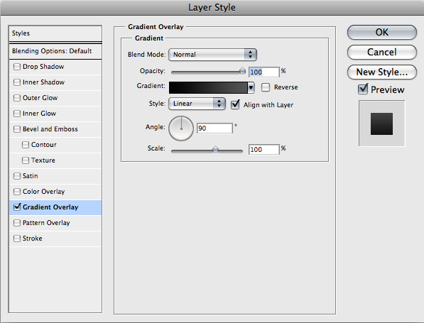
Make sure the "Shape Layers" option is highlighted in the toolbar.Next, go to the Layers palette and click on the "Add a Layer Style" icon at the bottom. Choose "Gradient Overlay" from the popup list. In the Layer Styles window, create a new gradient from black to grey (I used a hex value of 545454). It should look something like this:
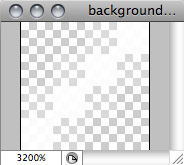
Now I'm going to create a diagonal tiling background pattern. Create a new Photoshop document of 4px square. Zoom right in, and using the Line Tool, create a white diagonal line going from the top right corner to the bottom left. Hold down Shift as you draw to constrain it to 45 degrees. Double click on the background layer and hit OK to make the Background layer into a normal bitmap layer. Now turn that layer's visibility off in the Layers palette. The document should look a little like this:
Choose Select > All from the menu and then go to Edit > Define Pattern. Choose an appropriate name if you like. Now head back to the original header document.
Create a new layer above the rectangle with the gradient and fill it with black. Double-click it to bring up the Layer styles and go to Pattern Overlay. Your new pattern should be in the drop-down list of patterns. Select it and you should see your pattern in place in the document. Click OK, and the adjust the layer's opacity to around 5%, or whatever you think best. This has the effect of reducing the effect of the pattern to "just about visible" levels.
So now we have a nice basis for our header. The gradient and pattern serve as a backdrop for what comes on top. The pattern especially will really emphasize the effect of reduced opacity of any layer above it, and the gradient is practically essential in current web design thinking!

Step 2. Adding logo.
I'll be creating a header called "Army is Greener", so select the Type tool click on the image and type it out. In our example here I've used all lowercase, with no spaces to keep the modern feel. I've used Arial Bold at 48pt. I've also pulled in the Tracking to -50 to tighten the space between the letterforms a touch. For the colour I've chosen a really vivid yellow/green of d0e113.To differentiate the "is" in the middle of the logo so it's readable, I'm going to select just those two letters using the Type tool and make them white (choosing the colour either from the Options bar or the Character palette).
I'll give the logo just a hint of a glow to make it "breathe" a little on the page. Click on the "Add a Layer Style" icon at the bottom of the Layers palette and choose "Outer Glow". You want a smallish yellow glow with a Size setting of 5, at quite a low opacity, so set that to 25%. You can see the settings and their effect below:


I'll also add a tagline of "a sample website banner" to the logo. Again, use Arial Bold (or Helvetica Bold) with the Tracking set to -50. I've set the font size to 14pt and aligned it with the right of the logotype above. To add the same glow as we used in the previous step, go to the Layers palette, hold down Alt/Option and drag the layer style from the previous layer to our new tagline.
Lastly, I'll have a box framing the logo, which I'll create using a Shape layer. Select the Rounded Rectangle Tool and set the corner radius to 5px in the Options bar.
Click and drag to create the shape, until it's a little wider than the logo, with about 15-20px of clear space in all directions. If it's sitting on top of the logo, drag it down in the layers palette so that it sits beneath both the logotype and the tagline. I want to position it off the top of the image, so using the Move tool just drag it off the top a little to lose the top rounded corners. You could also use the shape editing tools to re-shape the top of the box, but it's a waste of time in this instance.
For positioning, I'll put the edge of the box 20px in from the edge of the image, and set the text 20px down from the top. Really I should align the top of the main text body (the "waistline" in typo-speak) at 20px down, but that feels too high, so in the end I think instead that pushing the top of the dot of the "i" 20px down suffices.
Now, we'll use our "dragging Layer Styles" trick to drag the Gradient Overlay from the background to the new box. So Alt-drag the Layer Style to that box in the Layers palette, and you'll see it take on the same gradient as the background. I want to see an illusion of transparency here, so I'll drop the opacity of the layer to around 36% to allow the lines in the background to be visible.
Finally, double-click the layer to bring up the Layer Styles window, and now we'll add just a tiny Bevel and Emboss effect to make the box "sit into" the background a touch. The settings for this are in the screenshot below.

Step 3. The grass.
Now comes the fun bit - drawing the grass. Note that we're not after photo-realistic grass here; just the suggestion of grass. I want a very stylized version, and I'll build it up using three of layers of brushes and gradients.To start, create a new layer in the Layers palette by clicking the "Create a new Layer" icon at the bottom of the palette. This is going to be my "background" grass, which will be quite a dark green. Changing the colours for each layer adds depth to the image. I'm going to choose 667e04.
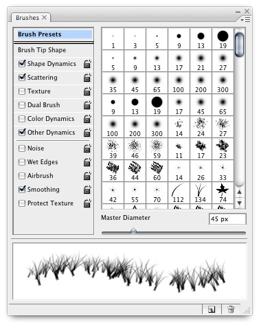
To create the grass, I'll use a brush. Click on the Brush tool, and from the Brushes palette, find the Grass preset. It's a little big as it stands, so drop the size to around 45px. Your Brushes palette should look a little like this (Note I've turned off the Color Dynamics since I just want a solid colour at this stage):
I'm going to add another layer of grass above the first, but this time using the light yellow/green colour from the logo (chosen to add consistency). Use the Eyedropper tool to select it by clicking on the green in the logo, and reselect the Brush tool. Just brush it on as before to create a "highlight" layer.
Lastly, I'll add a bit of a glow to the whole thing which just livens it up a little. Create a new layer above the previous two and select the Gradient tool from the Tools. If you followed the last step, you should have the light green from the logo as your foreground colour, but we want that to fade to transparent rather than another colour. In the Options bar, open the Gradient Picker and choose "Foreground to Transparent", as below.
I'll click at the bottom of the image and drag upwards until it's just past the top of the grass, where I'll release it. That effect's too much, but now I'll drop the Opacity of the layer to around 60% to soften the effect.
Finally, I'll add a bigger grass stem in the background that will show through the translucency of the search box. This should really emphasize the depth in the image. On a new layer, I'll use a bigger version of the grass brush we used previously. This time it will be around 230px in size, and use a dark grey colour. I'll choose #282828 for this; not quite black as we want a slightly softer effect than the black would give us.
Drag the new grass layer in the Layers palette to just above the lines in the background, and add a couple of touches of the bigger grass to the layer so that it sits behind the search box. Try changing the size slightly between each dab of the brush to add more variety.
And that, as they say, is that! The final image should look something like this:
Get a feel for what it looks like with different alignments, composition and colours to see how the various elements fit together, and play with those Layer Styles to get a feel for how they can affect the perception of depth and tone. Above all, have fun!
Junjun Segura
